You may be surprised to discover that WALL·E and Idiocracy are, in fact, the same damn movie. (In the screenshots below, WALL·E is at the top, and Idiocracy is at the bottom. Although it might be hard to tell, because they are the same damn movie.)
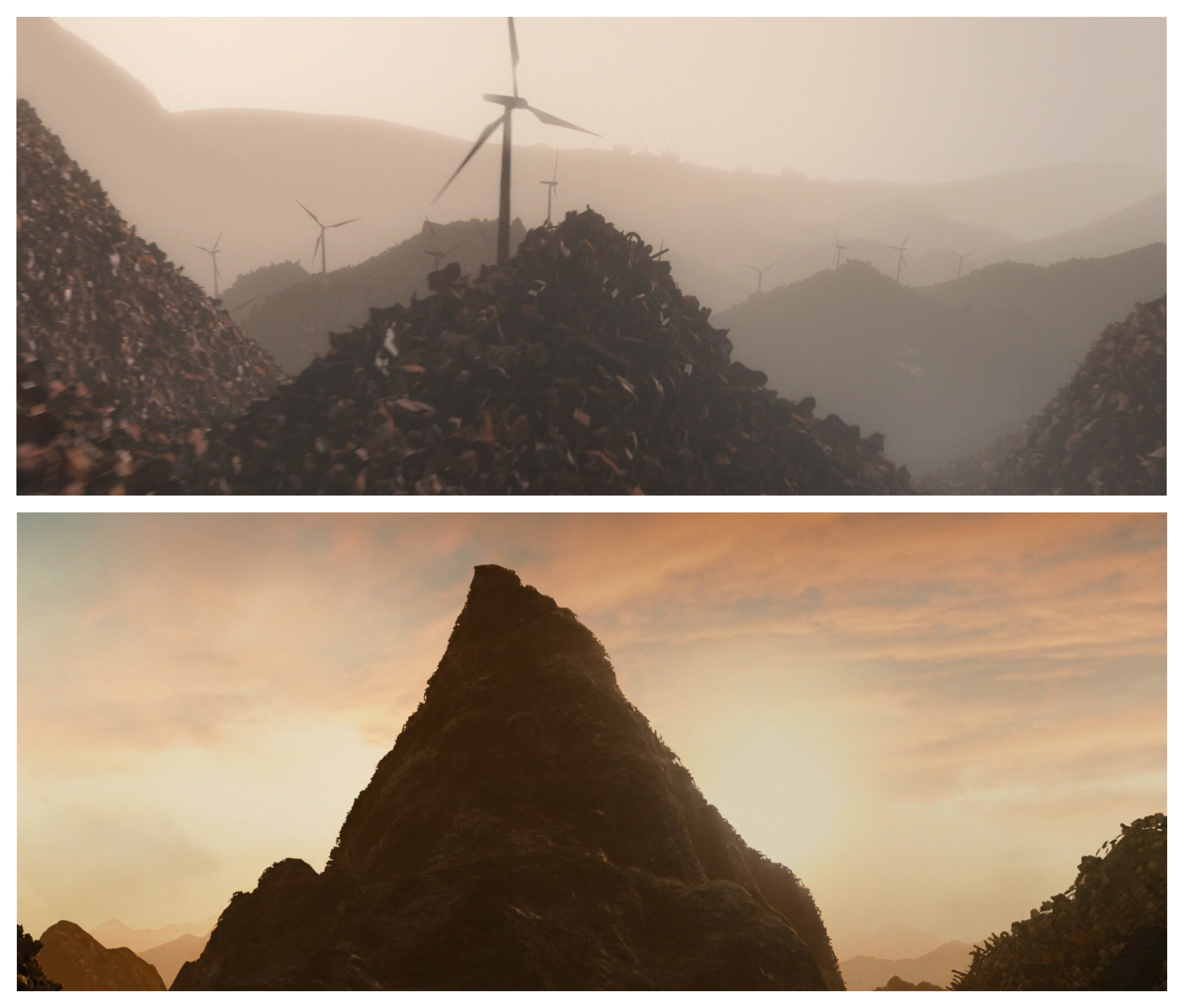
Hundreds of years of consumerism have led to mountains of trash.
City buildings have fallen into disrepair, surrounded by dusty tracks.
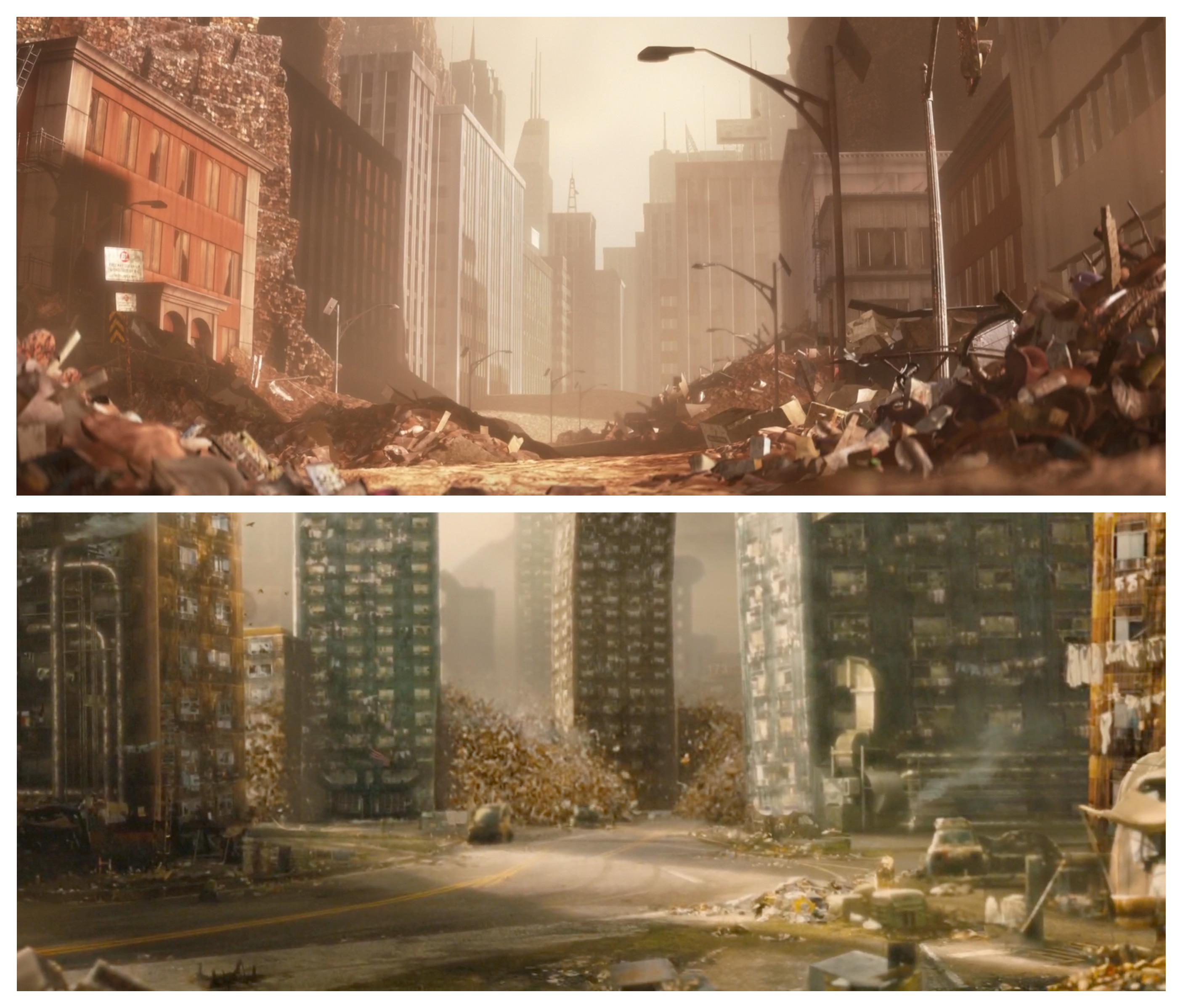
Infrastructure is crumbling; roads are falling apart.

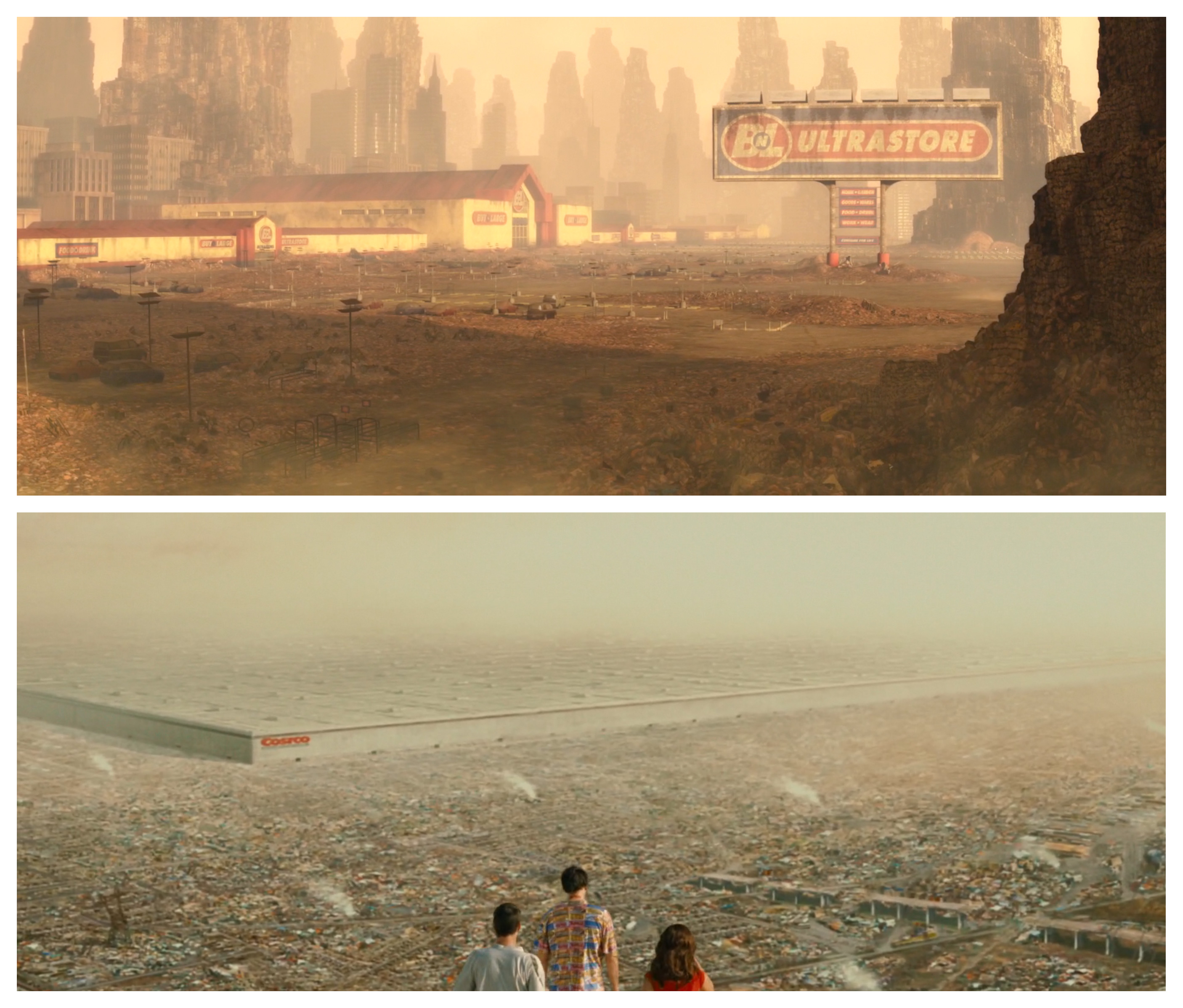
Stores have become town-sized superstructures.
Corporations have taken over government.

Hyperinflation and a broken economy have led to ten-million-dollar bills as common currency, complete with corporate branding.

Regular dust storms plague the environment.
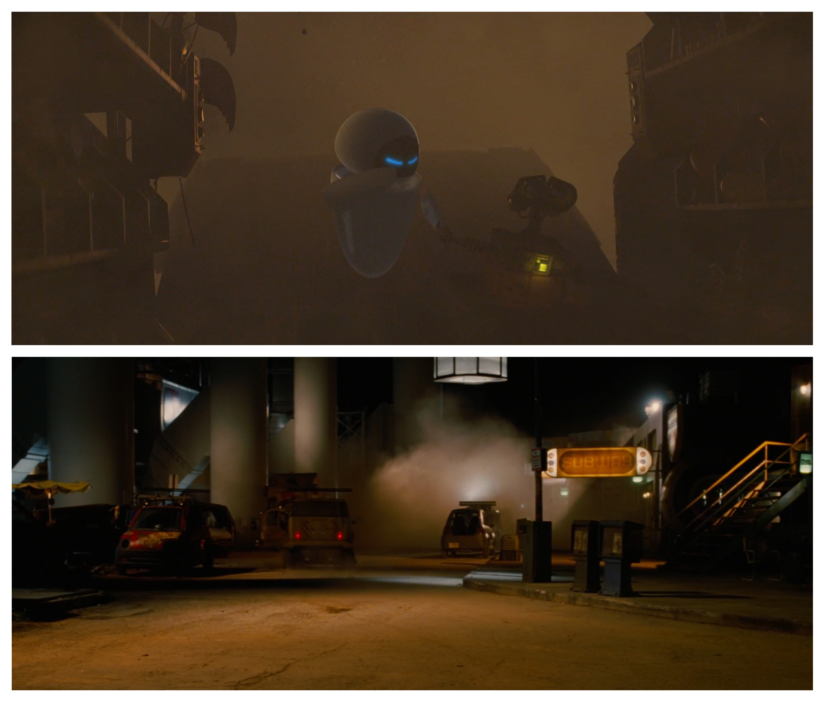
Cute robots try fruitlessly to clear away humanity’s mess.

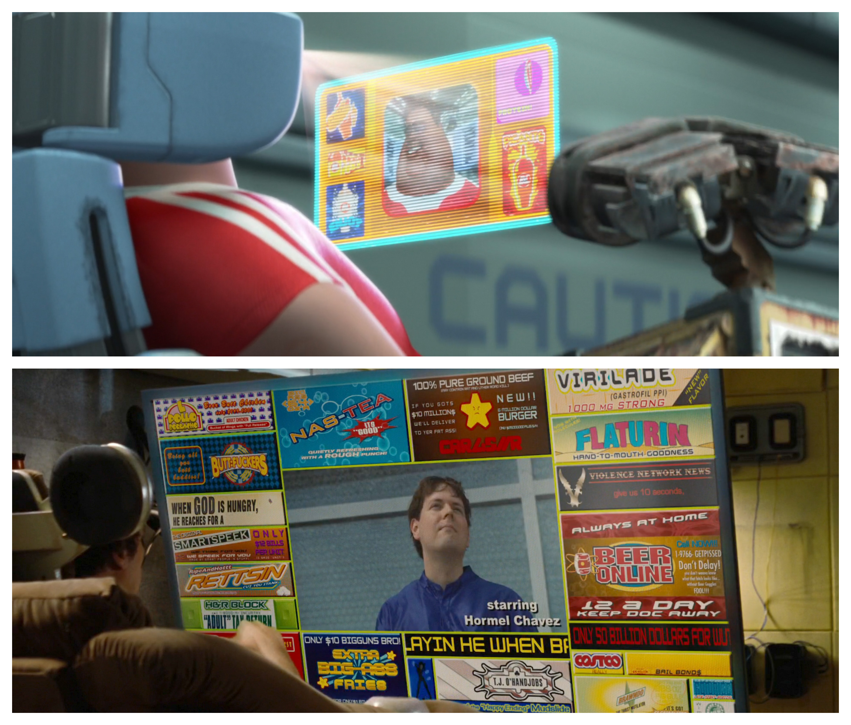
The humans themselves live in comfy chairs with built-in speaker systems, drinking through a straw.

The images they see are surrounded by omnipresent advertising.
And crucial to both movie’s plots: the restoration of plant life on Earth is essential to humanity’s future.

The subject where WALL·E and Idiocracy agree most, however, is the typography of the future.

Fonts will be bold and curvy; text will be outlined with chunky strokes; colors will be garish and oversaturated.

And whatever the text may say: it’s bound to be selling you something.

